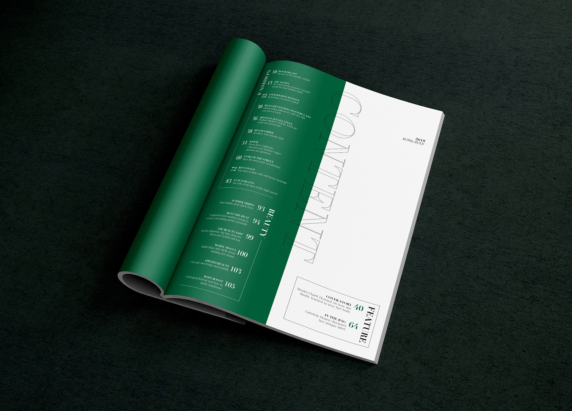
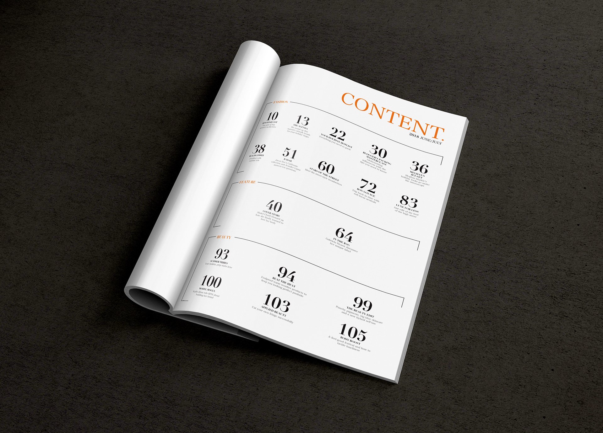
This project was to teach students about guides, grids and hierarchy by creating content layouts for magazines. Hierarchy helps readers differentiate the most important information on a page. Some elements that can be used for hierarchy are lines, colour, typeface families, capitalization of text and much more.
The goal was to explore how different elements, grids and typography can create legible and effective layouts with a sense of hierarchy, without using images or illustrations.
I discovered that many content pages used a 12-column grid that allows them to organize a large sum of text in an easily legible way. In Adobe InDesign I created a 12-column grid using the tools that InDesign offers as well as set margins. I used colour, the weight of the type, different sizes and lines to create a sense of hierarchy within the layout.